Summary
- Artificial intelligence (AI) is increasingly being adopted in various industries, including UX/UI, which has the potential to generate a wide range of design options quickly and efficiently, helping to spark creativity and inform design choices.
- Platforms like Midjourney offer AI-powered tools for image generation, including UI designs.
- Hands-on experience with Midjourney has shown that it can generate visually appealing UI designs, but there are limitations in terms of attention to detail, accessibility, and functionality, and a complete lack of UX.
- AI-generated designs can be used as a starting point for quick projects or used as references for more complex ones, but a human touch is still needed for a better user experience.
- Knowing how to balance the use of AI with a proper UX/UI process can result in great projects.
Artificial intelligence (AI) has been making its mark in various industries, with applications ranging from content generation to voice and video creation. As more and more industries adopt this cutting-edge technology, the way we think about possibilities is evolving. However, many questions arise from it, from ethical concerns to job loss fears.
In the past few weeks and months, AI has also made its way into the world of UX/UI design, with many designers wondering whether it could be a viable tool for generating design ideas and streamlining workflows, and others criticizing the use of AI and their concerns that it could cause for our field.
On the bright side, one of the main benefits of using AI in UI design is unlocking a plethora of new opportunities like never before with its ability to generate a wide range of design options quickly and efficiently. This can be especially helpful when starting a new project and trying to get a sense of the direction it could take.
By feeding design concepts and styles into an AI system, designers can get a diverse set of ideas and inspiration that can spark creativity and help inform their own design choices. Website, landing pages, dashboards, mobile apps - there are lots of possibilities to be discovered and generated, and we are already seeing many people using those tools for UI.
This technology is allowing designers to explore new horizons, generate an almost infinite number of possibilities and give them the freedom to create like never before. With AI, it looks like the sky is the limit. Or maybe not?
Our hands-on experience generating user interfaces with AI
One platform that offers AI-powered tools is Midjourney, a Discord channel open to the public where you just need to type a prompt and the AI generates different versions for you.
It's not exclusive to UI, it can be used for any kind of image generation, such as ultrarealist photos, illustrations, fantasy images, and even images like logos. Actually, UI generation is still a small portion of what is generated, mostly because it was only possible after their new version 4 elevated the powerful tool to a whole new level.
We've had the opportunity to use Midjourney and were impressed by the convenience and flexibility it offers. After a few attempts trying to understand what would be a good prompt to reach great results, we were able to generate a few impressive visual-appealing UI designs generated by only typing some words.
Trying with simple websites
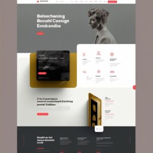
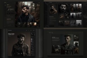
We first tried a simple photographer online portfolio, and we chose one of the generated to move forward:
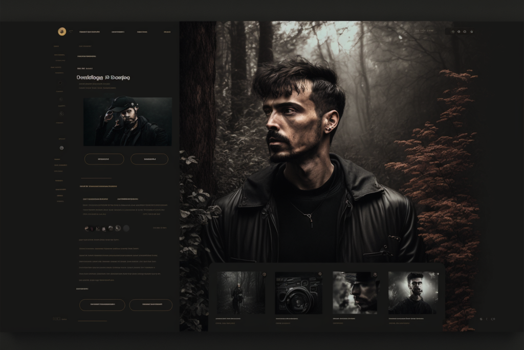
As it can be seen, the AI tool can generate a visually appealing interface, however, it doesn't focus on details. Buttons, small elements, and especially text are misformed making the interface unusable the way it is. Don't expect it to deliver a ready-to-use interface, it can't and it won't be a good interface.
However, The results are interesting and useful to start the project, considering that it will need some work to be a functional interface
We then replicate it on Figma to grasp an idea of what would be the process of using AI-generated websites for a real project - this is the first stage where a human needs to step into the process.
Our focus was to create a similar interface, but we noticed that a few elements were still not so intuitive, and here is, again, where a human should step in and understand what is needed for a better user experience.
We come up with a second version, just playing around with some elements, making the category selector more intuitive - it wasn't clear if it was a category selector, and what were the other categories.
Although we had to make some changes, we think that Midjourney did great work with a simple interface like a portfolio. In cases like this, we think that it could be used as a starter for quick projects.
However, how good would it be in different projects? We decided to go to something a bit more complex, as we were certain that it wouldn't provide an almost ready-to-use design.
A bit more complex website
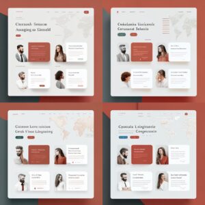
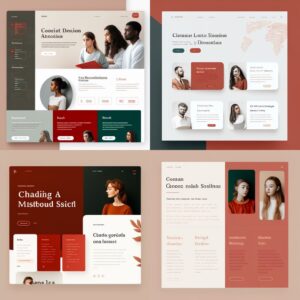
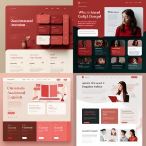
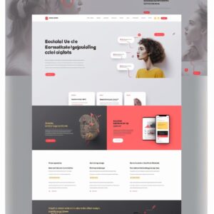
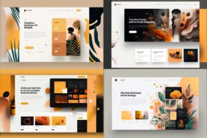
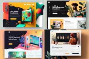
We asked for a language school website asking for a specific color pallet and generated several alternatives that were very interesting. The results were very pleasant and included the colors we requested.
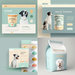
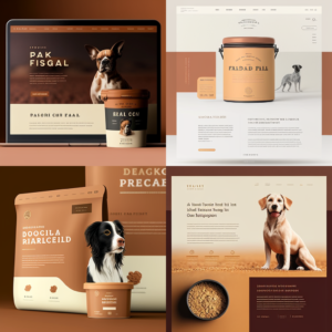
However, none of the generated websites could be used as an initial base since the content wouldn't be the one that the AI tool generated. The content for this specific project would be very different from the generated image, and as we know in UX/UI, content is king and the interface needs to fit the content, not the other way around. This is the case where the AI-generated UI images would be used as (great) inspirations when creating a mood board, but not as a base for the first draft.
Generating a redesign of a content-heavy website
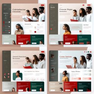
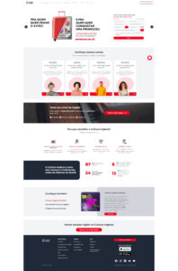
To test another possibility, we used a live website, www.culturainglesa.com.br, to see the extent of the capabilities of Midjourney in two ways: if the platform can use an image as a reference and produce a good result from it; if it could replicate the page as mentioned, making the interface fit the content.
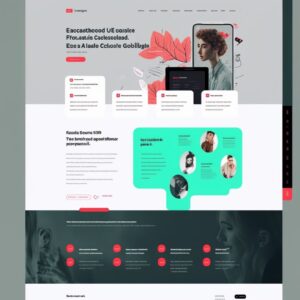
The results of several attempts with different prompts can be seen below - impressive nonetheless, it got the essence a bit and used the black and red of the brand, however, it's clear that it's still lacking a more human vision, content fit, and compliance with the branding as well - it used a yellow and green that was not part of the original website but were included in photos.
We gathered insights from the most interesting options and designed a quick version using the original content and the correct branding colors:
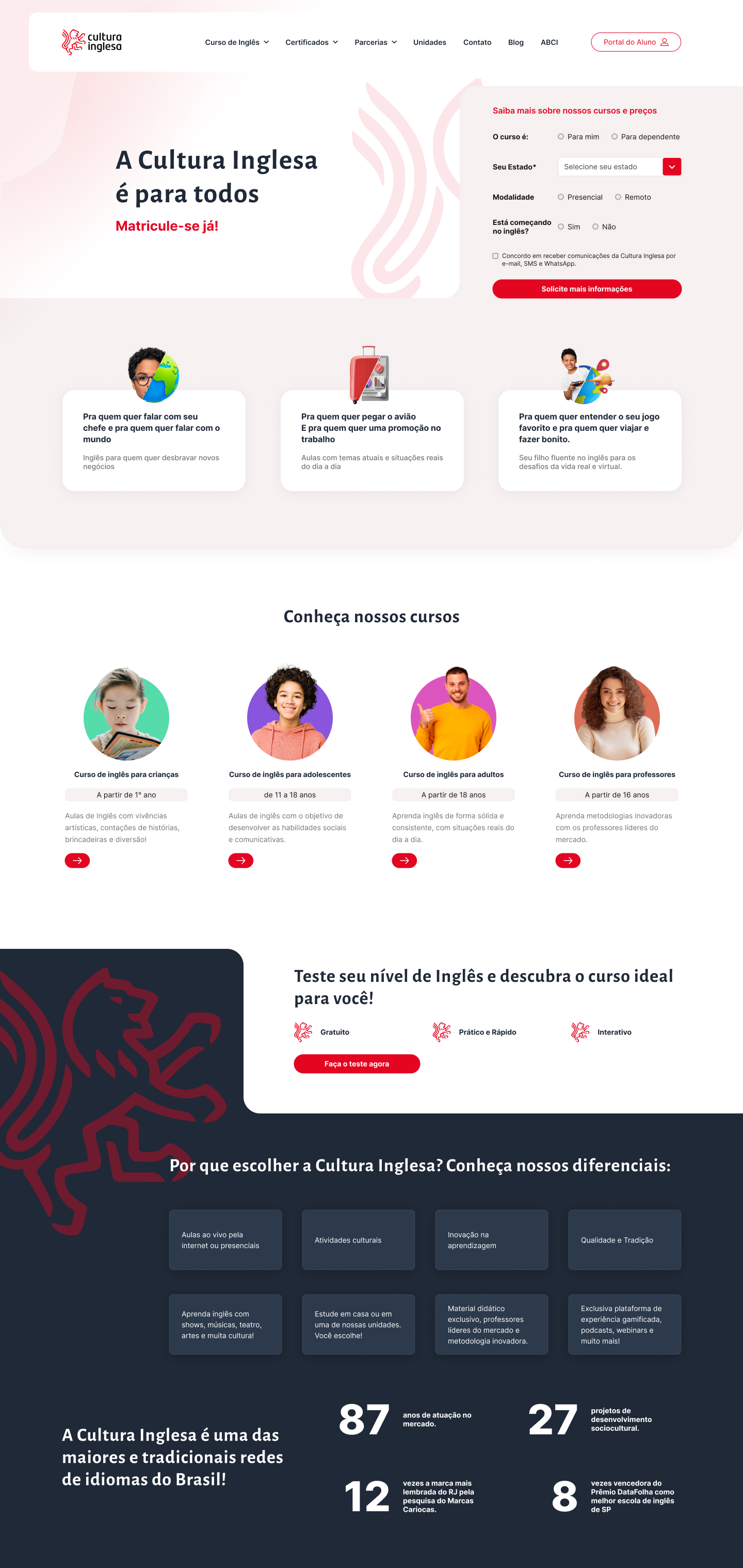
Overall we thought that it helped us to create a visually appealing interface, serving as original inspiration during our mood board process, saving us time. However, it took longer than just replicating the interface as we did with the photographer's portfolio.
In cases like this, it's valid to use AI-generated images as references for the designer's work rather than a quick tool to generate final interfaces.
Pushing AI to its limits - a more complex UI for a dashboard
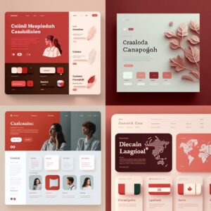
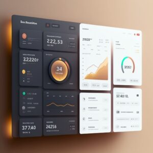
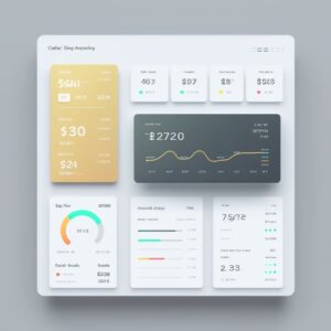
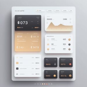
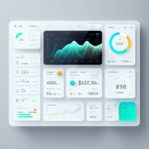
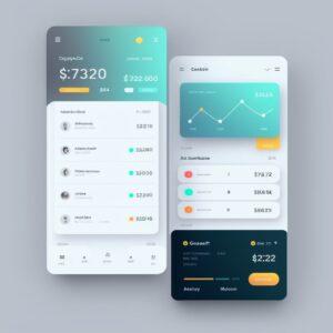
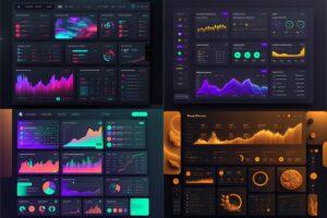
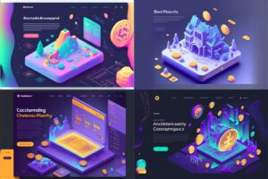
In a last test, we decided to see how it would handle a more complex interface for a digital product, so we asked to create a fintech dashboard, including information like credit cards, transactions, and quick action buttons. We got visually impressive results on the first attempt:
The results were very close to what was expected: a beautiful dashboard that easily can go to a fintech app mood board.
However, here is where UX is heavily damaged
- Lack of accessibility on several elements: We have elements that have a very low contrast ratio that makes them hard to see and read the texts
- Lose of focus: on some parts they have a lot of information going on
- There's no user flow to make a proper evaluation of how, where, and if elements can be presented.
We see again how important a proper UX process is needed to bring those AI-generated to life. A designer can understand the users' pain point and their needs in order to plan the project with personas, user flows, customer journey maps, and other tools that will guide the work toward a more intuitive user interface.
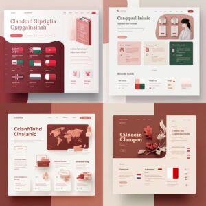
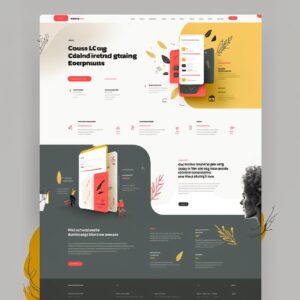
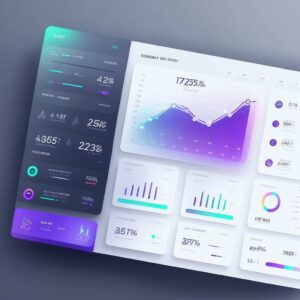
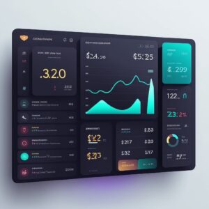
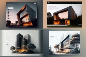
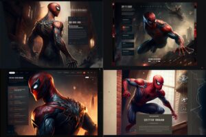
More AI-generated interfaces
Benefits and limitation of AI for UX/UI Design
As with any AI tool, it can’t fully understand or replicate the nuances and complexities of human-centered design. The designs generated by these tools are not necessarily ready to use as-it-is and should be viewed as a starting point and a source of inspiration rather than a replacement for human input and judgment.
It’s important to remember that UX design is all about creating a seamless and intuitive experience for the user. This means that the design must be tailored to the needs, motivations, and behaviors of the target audience who will be interacting with it, which an AI system can’t comprehend or anticipate.
It’s ultimately up to the designer to bring a human touch, empathy, and understanding to the design process, using their own expertise and judgment to make informed design decisions. Only through user research, testing, and feedback can you gather insights into what will work best for them.
The ability of any AI tool to generate precise results is also dependable on your ability to describe what you want with the right words. We had to try several different prompts to start getting a feeling of how to write good prompts. And even then, with each new idea we came up with, we had to make more attempts until we were satisfied with the results.
Another limitation is the impossibility to extract elements and images from the AI-generated images as they are not separated, you receive a PNG image file. Most of the time, even with simple projects like the photographer’s portfolio, designers need to use other elements or even try to generate them separately, for example, a banner background image.
Designers need to learn how and when to use AI
AI tools should be viewed as a supplement to the design process, helping designers to explore a wider range of options and possibilities before honing in on the design direction. It won’t take our jobs (at least for now), but embracing this new technology requires a critical sense.
In order to create truly effective and user-centered designs, designers must always be attuned to the needs and behaviors of their target audience, using a combination of research, testing, and their own expertise to guide design decisions.
As long as they strike a balance between the convenience and efficiency of AI tools like Midjourney and the unique perspectives and insights of human users, designers can create truly effective and user-centered designs.
Overall, our experience with Midjourney was positive and we think this could be a powerful tool and a valuable resource to help designers with particular tasks, as long as doing it with caution and not relying on them too heavily.
It's also clear that it's not even close to the end of our jobs, given there are several limitations that may not be resolved soon - or possibly ever? Who knows.
ps.: the banner was also created by Midjourney
Have you been wondering how to improve the user experience of your digital product? How to make it more intuitive and easy to use, with higher conversion and retention rates?
User experience design is a discipline that focuses on creating an accessible and enjoyable experience for users of digital products and services. It’s a vast field with many nuances, yet it is often oversimplified by the general public in the form of advice such as “Just put a pretty face on your site!”
The best user experience doesn't come from an algorithm that analyzes data and figures out the best way to serve your users. Instead, it results from an intimate knowledge of users and the way they interact with technology, you need to understand them. By understanding their needs, habits, and goals, you can design a better user experience.
That being said, the user experience is not purely about technology, you need to consider the user journey. This means knowing where users start from and what their goals are.
With user experience, you should also think about how users feel while using your app. Do they feel comfortable and welcome? Or do they feel distracted, frustrated, or annoyed?
Here are some tips on how to design a better user experience.
Start understanding your users’ needs and demands with a UX Research

The best way to start improving the UX of your product is to focus on the user who uses it before any design and implementation are done, either to start a new digital product or to improve an existing one.
If you don’t know what your users want and need, then the end product will likely be sub-par. Study your target audience to gain insight into what they want to design interfaces specifically for that public.
This can be achieved by conducting a UX Research to gather data and insights on what people want and need from your product, how they interact with the interface, and their behavior along the user journey within a digital product.
A UX Research study can involve a survey, focus groups, user testing, or interviews to collect information on their demographics, behavior, and problems they face. The data is prioritized according to what is most pressing for the users and used to inform product decisions and propose proper solutions.
Conduct a UX Audit

Meanwhile, a UX audit is a process of inspection and evaluation of the design of an existing product. Basically, a deep dive into your digital product. It is a systematic analysis of the user experience with the goal of identifying areas for improvement and getting the designers aligned on the right strategy.
It helps you understand how people use your product and how they feel about it, uncovering potential problems and suggesting potential solutions. A UX audit is a great way to take a second look at your product and see what could be improved in terms of UX.
A good UX Audit will help you build a product that people love to use.
Keep it simple, focus on the functionality
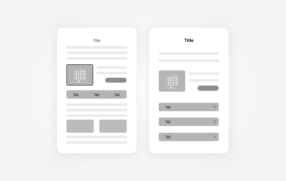
When designing an interface for a product it is important to keep it simple. The idea of design simplicity for a better UX is not just about doing less, but doing what is important, being objective, and delivering straightforward information and directions in a clean interface that will guide users to accomplish their goals.
The simpler an interface is, the easier it will be for users to navigate and the less likely they will bounce. Because of that, it's important to focus on the content and functionality rather than focusing on purely visual elements. They are important as well, a visually appealing interface helps build trust and express professionalism, but they are rather an add-on.
It's important to understand that simplicity is not the same as minimalism design. It can definitely be used if it suits the overall look 'n feel, but we can also achieve simplicity by creating an atmosphere that is free of clutter, taking away what does not add value to the interface. Increasing whitespace is also helpful to legibility and it's faster and easier to find what users need.
Accessibility

Accessibility means making sure that anyone can use your product, regardless of their physical or cognitive abilities.
With the rise in people with disabilities and the overall internet usage where 67% of the world population has access to the internet, accessibility has become a standard expectation with websites and digital products.
Some simple changes can make a big difference for many people. By making small adjustments you can create an experience that is truly accessible for all. Image captions and alternative texts for example can make the visually impaired understand what is shown in the image because the screen reader will read the provided texts as a description of what the image represents.
Existing documents like WCAG 2.0 (Web Content Accessibility Guidelines) from W3C (World Wide Web Consortium) or Section 508 from ADA (Americans with Disabilities Act) provide recommendations on how to create accessible websites and apps.
Lack of accessibility is even a case for lawsuits. In the USA, the previously mentioned ADA Guidelines are a requirement for most businesses. Not being ADA compliant can lead to lawsuits. Thousands are being filed every year and it can mean from 10 thousand to millions in losses.
Maintain design consistency throughout the journey
When designing your digital product, it’s important to continue certain patterns through the user flow. Elements, colors, fonts, copy, icons, interactions, and overall look 'n feel should be homogeneous and repeat themselves throughout the product. This creates a cohesive experience for your users and allows them to navigate through your product with ease.
Design consistency provides a sense of familiarity and comfort to the user and reduces the chances of them getting lost. It avoids having to relearn a pattern for similar content and getting confused, improving the overall usability.
We do that by defining a scalable design system right at the beginning of the project, keeping the consistency of the elements even if they are modified later. It's easier to scale the product in the future as well.
Applying the best practices for UI also helps users recognize widely used patterns that were already extensively validated. It's a way to start off on the right foot especially if you for any reason can't do a UX research before designing the interface.
Ask for User Feedback
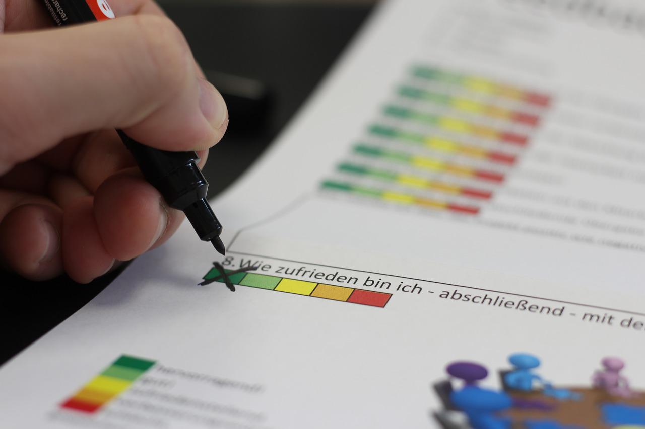
Without knowing what users are experiencing while using your product, there's no way to improve it. If they have a bad experience and don't have a way to tell you about it, you might lose the user and don't even know why.
There are several ways to ask for feedback from users and it all depends on how they use your product, but the most important is to ask it promptly. Have a feedback tool right inside the product, or ask when the user is leaving or after a specific event, such as at the end of a journey as a purchase in an e-commerce. Just the fact that you're asking for feedback shows that you care about the user experience.
The cost to acquire a client is much higher than retaining one. Meanwhile asking for feedback is free and one of the easiest ways to improve the experience to keep users satisfied.
Conclusion
UX design is a growing field that is constantly evolving. There are many ways to improve the UX for your digital product, and maybe most of them need a team of experts to implement them.
Pengreen Design is a specialist in improving the usability of digital products and can handle a UX Audit for your digital product. We help Software Development Companies reduce their frustrations with bad conversions rate and low satisfaction from customers by understanding users' behavior and delivering the right content they need and expect. Our team of experts can go through your digital product and identify potential issues that may be driving customers away.
Because of the pandemic, Germany was offering double incentives for electric car purchases, and seeing it as a good opportunity, a German wanted to exchange his Ford Kuga for a Tesla Model 3 with autopilot, the entry model of Elon Musk's automaker.
He then proceeded with the purchase, added his details and credit card, and clicked "confirm" to place the order with Tesla. But nothing happened, the button continued as it was, no message was shown, nothing different that could indicate that the order was being processed or even that it had already been placed or denied. As a result, he clicked again, as it might simply not have gone. And again, and so on 27 other times within two hours - what a persistent person!
After several attempts, the site finally changed and processed the request - not just one, but all 28 attempts, totaling 1.4 million euros for the 28 Tesla Model 3. Not only that, but if the German would ask to cancel the 27 extra orders, he would still have to pay 100 euros for each cancellation, totaling 2700 euros more than just the 100 euros deposit expected by ordering just one car.
This is a clear error in providing a good user experience and infringed on two Nielsen's 10 heuristics.
- The first is to prevent the user from making mistakes. When they click on a button that sends information for processing, you must immediately disable it in order not to be clicked again.
- The second is to always and promptly inform the system status through clear feedback. After the button is clicked, it is necessary to inform the user that the site is processing the information and ask them not to close the screen to avoid errors.
There were also processing errors that did not directly affect UX but, as seen, indirectly. The slowness in processing the order and the failure to allow the other 27 orders to be processed before any return had been given from the first one were also determinants for that human error.
This shows that design and development teams must work together to avoid a situation like this.
In the end, the German desperately called the company, and, understanding the error that had occurred, Tesla refunded the 2800 euros for the mandatory deposit and invited the man to place his order again.
The question is: is he going to buy again after that error? Is the trust destroyed and the customer lost?
We need to avoid that kind of error to happen in the first place instead of fixing it later. The cost will be higher for sure, not just in terms of internal development to fix it, but also lost in revenue and customers, not to mention having to recover the reputation that was affected. A good UX strategy and well-conduct product design can avoid many trivial issues just like that one.
Check more examples of bad UI
Do you want to know if your website has UX flaws?
UX issues are more common than we can think and some of them we don't see unless they happen. Pengreen Design has an experienced team of designers ready to help you. We are listed at Best Tech Websites Of 2020 (So Far).
Unlock the full potential of your digital product with our transformative UX Audit! Uncover hidden design flaws that might be hindering your product's success, some of which you may not even be aware of.
First off, user experience design is not the same as or similar to marketing and vice versa. Actually, many times UX professionals even work against marketers and the last ones also go against the first ones sometimes. Personally, I already had a tough relationship with a marketer who wanted to sell at any cost and disregarded my UI/UX considerations, but this is part of the job and we need to understand both sides to accomplish a successful project.
Yes, they have points in common. To an extent, both have an ultimate goal of increasing conversions or keeping current users faithful to the service/product, both help the business and both need a deep analysis of human behavior to draw a good strategy. They do not exist without people's input. But they have many (and important) distinctions regarding the ways to achieve these mutual goals.
Users VS Metrics, Satisfaction VS Revenue - It's a tough balance. And they MUST work together in order not to jeopardize the other.
Let's first understand the concepts:
User Experience (UX)
Consists of researching the users' behavior and improving the experience they have by creating the best, most intuitive, easiest-to-use interface, where the flow is consistent and clear (and just an addendum, it does not apply only to web and mobile interfaces, this can be applied to the installation of a product, for example). The primary goal is to design with the user in mind, which eventually leads to the secondary goal (and kind of primary to who is paying the bill): to improve the conversions or keep users faithful to the service/product by providing a pleasant experience.
"User Experience encompasses all aspects of end-user interaction with the company, its services, and its products."
Don Norman and Jakob Nielsen
Marketing
It's the art of selling. The main goal is to increase conversions and consequentially, increase the revenue. To do that, marketers have to persuade people to buy the product or service, they use seducing ads, many times hiding important information and exaggerating the qualities.
"Marketing is a question of persuading, seducing and attempting to manipulate people into buying products and services."
Wally Olins
In summary, both must understand people's psychology, but marketing treats people as potential customers and it is not much concerned about their experience - more about selling -, and UX treats people as users and cares about their satisfaction. And that difference is problematic.
When the problems start and how they should help each other
UX endlessly states that a good user experience should not confuse or trick the user, it should give all the information to the user and always provide clear instructions and paths so the user can choose what he wants to do with a full understanding of the content and consequences without surprises or frustrations.
UX should never take advantage of the lack of or misleading information. These strategies are often in marketing to try to trick users with the ultimate goal of SELLING - nothing wrong with selling, we need it, but there is a thin line between white-hat selling and black-hat selling.
A marketing campaign with a heavy selling goal can jeopardize the user experience by applying dark patterns. Dark patterns are strategies that aim to persuade people into doing something they don't fully understand and may not even consciously want to do.
Examples of that can be: adding the user to a mailing list without consent (which is now illegal in many countries of the world, such as the whole of Europe, the USA, Brazil, etc.), seducing the user to buy a product without more information to a rightful and thoughtful decision, making customers to buy extended warranties or upselling products without proper or misleading information of them, etc.
Dark patterns can cause some controversial discussions. Sometimes it's hard to say if something is or isn't a dark pattern, and people can have different views - it's a thin line separating dark patterns and good patterns.
Regardless of marketing strategies, developing a project that does not take into account the user can bring more harm to the company image than conversion. If the user has a bad experience before or after becoming a customer or falls short of what is promised when trying to use the product or service, or if they have somehow been deceived or have not given consent for some kind of extra service, they can get frustrated and the efforts to attract and keep a user will be wasted and will not have a sustainable return.
Even worse, this can create a bad reputation that will be difficult to reverse. The loss of irresponsible marketing without taking into account the user experience can be immense and leave damages of difficult and expensive repair.
At the same time, UX professionals need to understand the company and its goals. They need to understand what intrinsic value the company wants to pass to the user, who is the target audience, and develop an interface that matches that without damaging the user experience.
UX without business values is like a meticulously designed ship without a compass. It might be sleek, efficient, and well-crafted, but without a clear direction tied to the business's values, it risks drifting aimlessly in the vast sea of possibilities. Just as a compass guides a ship to its destination, aligning UX strategy with business values ensures a purposeful and successful journey for the digital product in the dynamic market landscape.
For all that to happen, it's essential to have clear communication between both teams to express the objectives that both teams have and the planning of those goals. Thus, the UX professional can offer the most viable options according to the information given by the marketers to obtain the desired result, always, of course, respecting the basic concepts of UX.
Basically, they must complete each other. UX should help marketers to make users convert more without making UX mistakes. Marketers should help UX professionals to understand how (and where) to lead the user to the desired goal by communicating the values of the company's products and services.
Do you want a team that knows how to work with business goals?
We have worked for years with marketing agencies and teams and we know how to balance a good UX strategy to make any product succeed and avoid UX pitfalls. Pengreen Design is among the Top Web Design Agencies Of 2020 according to DesignRush.
1) "Recommended view" limiting how the user should view the interface.
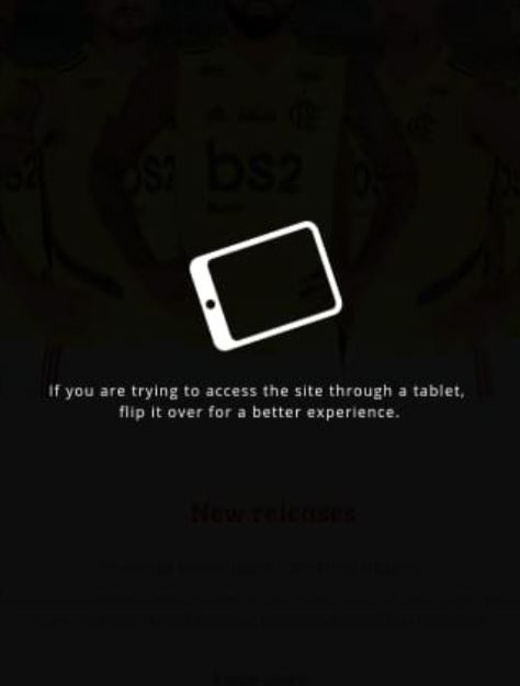
Responsive Web design consists of designing and developing interfaces to respond to the user's device based on screen size, platform, and orientation.
Not on this website. It asks the user to rotate the device to a landscape orientation instead of presenting the website nicely in portrait orientation.
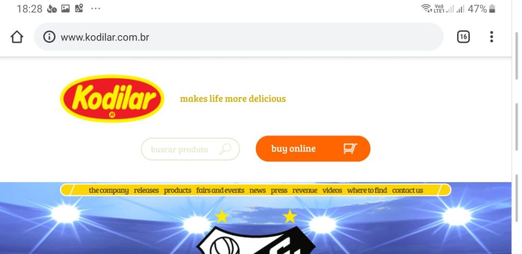
Not enough to limit the orientation, when the website is finally shown after rotating the smartphone, the user is presented with a bad interface, clearly not optimized for mobile.
Solution
Don't ever ask the user to adapt to your interface, your interface is the one that must adapt to the user's device.
Optimize it to EVERY possible device, orientation, and platform.
2) Primary and secondary button styles got wrong

When two or more buttons are close to each other with different priorities, we need to differentiate them. As a best practice, we can use two options:
- The primary button has the interface's primary color, which usually is a very striking or different color from the rest of the elements, and the secondary button has a less striking color, even gray in some cases.
The primary button has a background color whilst the secondary only has borders (which is debatable regarding ghost buttons, but this will be discussed in another post).
In this interface, they did the opposite for #2. The "finish" button, which should be the primary with the background only has borders. Whilst the "cancel" button which should be the secondary button has the background. The user can wrongly click on the "cancel" button without reading it properly thinking it's the "finish" button.
Solution
Follow best practices to show very clearly to the user which button is primary and which is secondary.
3) Content that's loaded after the interface is ready.
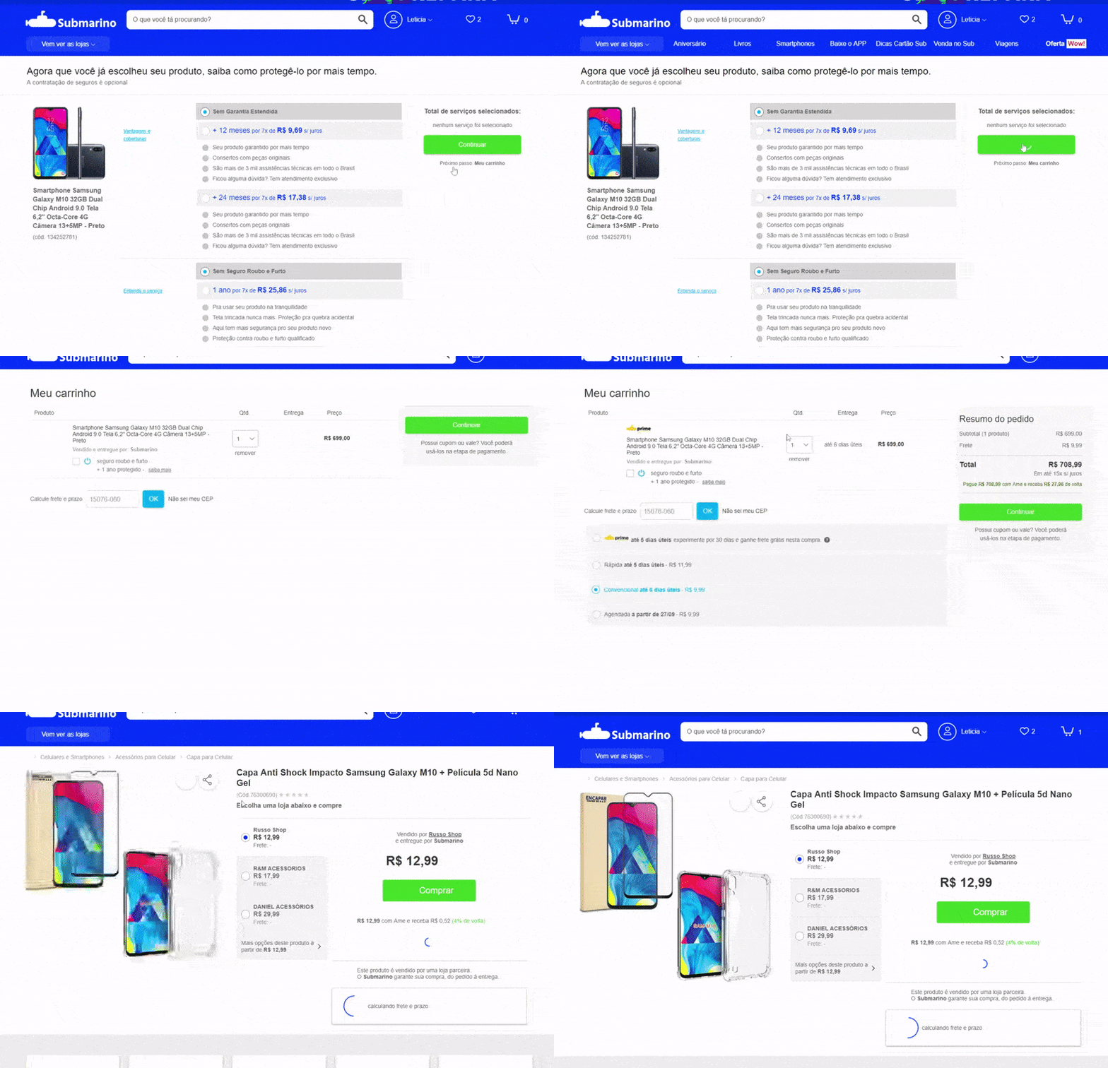
Sometimes we need to load content after the whole site is already there. But if that new content pushes everything down when being placed, you have a UX problem here.
Since the interface is already loaded, the user might be in the middle of an action, a click, a drag and drop. Having the content pushed down might cause unexpected behavior if the user clicks somewhere at the same moment that the new content appears.
The example below shows a shopping cart after adding a product. The e-commerce then loads related products on top of the cart after the content has already been loaded. If the user tries to change the quantity of the first product in the cart right at the moment that the related products are being loaded, it ends up clicking on one of them and going to the product page, frustrating the experience of buying that first product (Yeah, I did that many times, I always forget to wait for the related products, but this shouldn't be an issue the user needs to deal with).
Solution
Either load everything together or leave a space beforehand where the new content will be loaded to avoid pushing the content down.
4) Ask the user not to do something.

No, no, no. A big no-no. Never rely on the user's good behavior to avoid errors. The interface itself MUST avoid users' errors.
In this example, which is a WordPress plugin to backup and restore content, it asks the user not to click on the button until the restore is done, but leaves the button there! If the button is pressed, it can break the whole website. That's a very bad UX, it relies on the user not to break their own website! Even a wrong click can cause a mess. And if the person who is doing it is a layperson, they will have to hire a developer to fix the website.
Solution
Keep the warning not to close the browser, but remove or disable (and style them as such) the buttons that can cause error after a dangerous action begins and add an alert if the user closes the window/browser informing that some action is taking place and it's not recommended to close the browser.
P.S. Unfortunately, we can't totally block the user from closing the window/browser in cases such as this, as part of a security policy implemented by browsers, but we can at least warn users of the risks.
Update: updraft released a new version of this interface and now it's a lot more intuitive and it avoids such errors by removing the button off the screen.
5) Mislead user into paying more
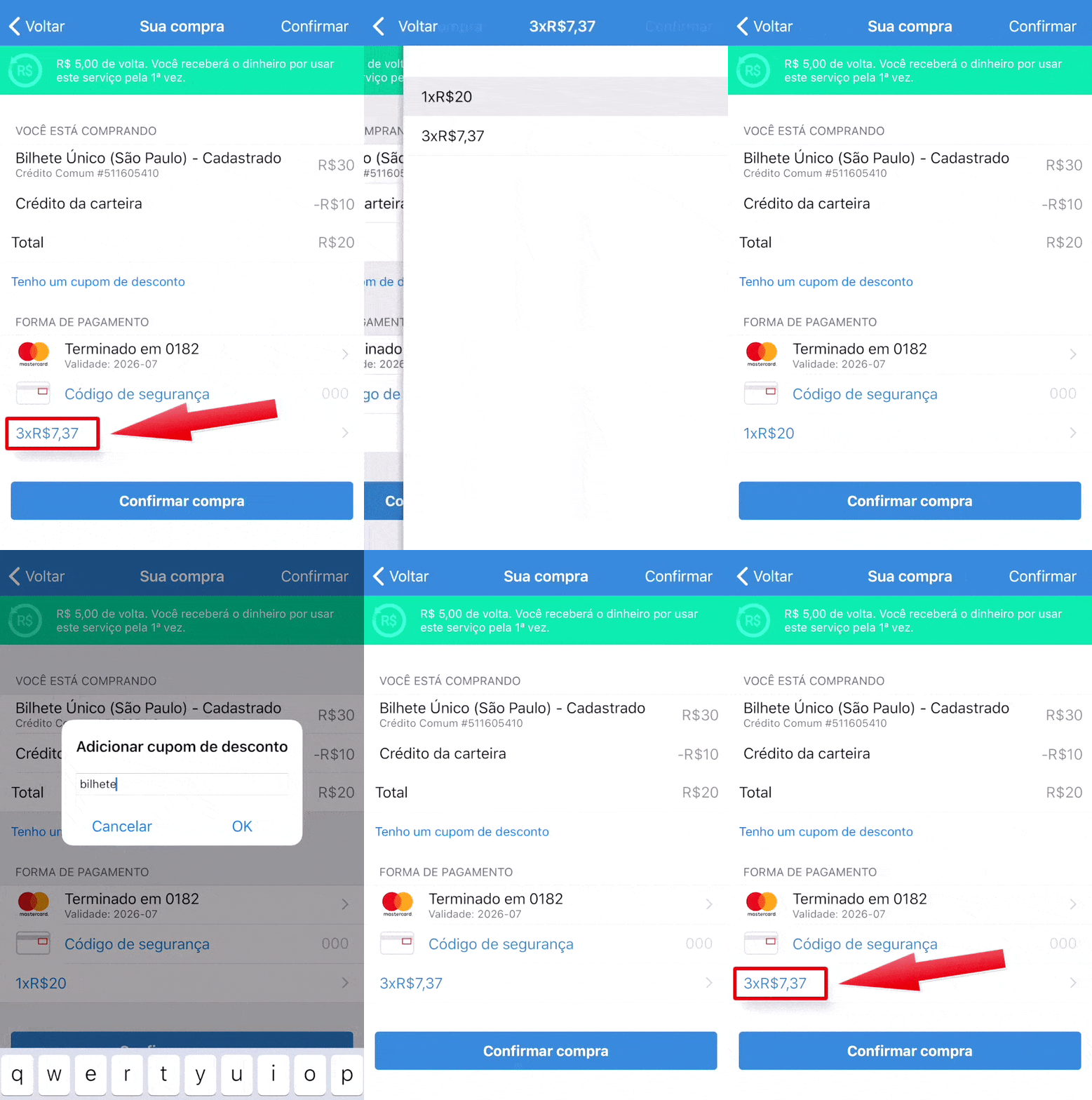
Here in Brazil purchasing in installments is very common, with or without interest clearly shown to the user.
On the app below, it shows first the value of R$ 20 in 3 installments (3 x R$ 7.37 = R$ 22.11, so you're paying R$ 2.11 in interest). The user has then the option to change to 1x without interest. But if the user makes any other change like changing the credit card to pay or adding a promo code, it comes back to 3 x R$ 7.37. If this change is not noticed, the user ends up paying more than they wanted to pay.
When you click to pay, a popup will appear offering a prime service for R$ 9.99 a month, with the option already selected. Many users have complained on Google Play and Apple Store about the R$ 9.99 fee they didn't want due to their mistake of not realizing the option was already selected.
Solution
Don't try to fool your users, have the interface follow the natural and intuitive way, do not pre-select options that will increase the cost for users, and never try to earn more by hiding fees or changing something users already selected how they want.
Avoid bad sales practices, they will hurt your reputation badly and will cost way more than what you're earning with those bad practices.
Bonus: Confusing arrows

Well, UX is not only digital, it's everything that communicates with your customer.
This one I saw the other day when in a department store in town.
In the store fitting room, you're presented with three options: Women, Men, and Kids. But the arrows are all to the floor! A woman can be confused if she should go left or right there because even though the arrow is positioned at the right of the text ("provador feminino", "women fitting room" in Portuguese), it's not clear that's the right side, especially since the arrows are slightly turned to the left.
Worse, no one was using the fitting room, so the customer didn't even have a reference to follow a side since both were identical.
Solution
Don't try to create something "cool" to impress users ending up forgetting the UX. Get your arrows straight in the right direction.
Worried about bad UI patterns?
Pengreen Design has an experienced team that offers design solutions for businesses to avoid bad UI patterns. We are also featured as one of the Top Mobile App Development Companies and Top Cross Platform Mobile App Development Companies.
Let's talk about a UX Audit and discover if your product has UX flaws
No, designers do not necessarily have to code. Unless you want to dig deeper into this area, especially interaction designers, you do not need to know how to code from scratch an interface. But it is extremely necessary to understand the basics. After all, the interface is the link between the machine and all back-end with the lay user, so it has to speak both languages.
The main points that a designer needs to think about to improve their work are:
Understand the structure: How will my design be implemented? In grids? Tables? How many columns? Can I place an element in a particular spot?
Understand responsive (web) or adaptive (mobile app): What are the most used screen sizes? What are the limitations of a smartphone? How do the landscape and portrait modes of smartphones and tablets work?
Work with technical possibilities and impossibilities: What can I do? What can I not do? Is this feasible to implement? What are the consequences of implementing this, am I going to jeopardize the user experience to accomplish what I designed? Will I drastically increase the development time?
Efficiency in developing: What can I do differently that will deliver the same experience - or even better - but make development more efficient?

The benefits are perceived by all involved:
- Developers: They will appreciate having an interface made with the code in mind because this streamlines their work, they do not need to implement different solutions that can cause bugs and lengthen the project. In addition, there is less possibility of blaming them for not developing as designed.
- End users: the experience of these people will be very close to the one desired by the designers because the differences between the design and the deliverable are greatly reduced.
- Business owners: faster delivery, better return for delivering the intended experience, and less stress, all of these translate into lower costs for those who requested the service.
Bonus: it is thus possible to develop a less patched and more agile interface, which facilitates future work and adjustments.
To summarize
Faster, cleaner, and better results in development, and a smoother experience for the end user.
Here at Pengreen Design, all our designers develop or know the basics of development so the interfaces are optimized and easier to implement.
Would you like to rely on a team of experienced designers who design interfaces with the code in mind so you can outsource design work and have an efficient project? Count on us! We’re recognized as a top User Experience Design Company on DesignRush, your project will be in good hands.


