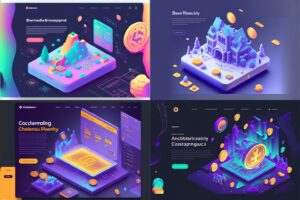
The startup ecosystem is transforming rapidly, and adapting to it is crucial. As 2024 goes by and we prepare for 2025, new insights are reshaping strategic design. Below are the key movements startups should embrace to remain competitive and innovative.
1. Sustainable and Ethical Design
Sustainability and ethics now dictate the design landscape. Consumers are increasingly scrutinizing brands' environmental and social practices. A 2023 McKinsey report highlighted that 66% of global consumers and 75% of millennials consider sustainability whenever they are deciding what to purchase. Startups are integrating eco-friendly materials and transparent practices into their design, responding to this shift, and they are seeing their sales growing more than others that are not following the customers' desire for sustainable products.
How to Apply:
- Prioritize biodegradable, recycled, or low-impact materials in product design.
- Implement full supply chain transparency, showcasing ethical sourcing and manufacturing processes.
- Design products with longevity in mind, reducing the need for frequent replacements.
2. Inclusive Design
Inclusive design is no longer optional. With global digital accessibility legislation tightening, such as the EU's European Accessibility Act coming into full effect in 2025, startups must ensure their products are accessible to all. This design philosophy dismantles barriers and fosters universal usability.
How to Apply:
- Regularly conduct comprehensive accessibility audits.
- Engage users from various demographics and abilities during testing phases.
- Strictly adhere to accessibility standards, including WCAG 2.1 guidelines, to ensure compliance.
3. Hyper-personalization and AI use
Hyper-personalization is revolutionizing user engagement. Leveraging AI and big data, startups now craft experiences that anticipate individual user needs. According to a 2024 Gartner report, 71% of digital businesses that harness advanced personalization will outperform competitors in revenue metrics.
Case study, Netflix
Netflix is well known for its disruptive business model, and how it has dominated the market. One of the ways it has done that is by hyper-personalizing the product towards the customer and giving them recommendations based on previous movies and TV shows.
This approach has given an astonishing number of 80% of watched content being from recommendation alone, leveraging AI as well.
How to Apply:
- Leverage machine learning algorithms to analyze user behavior and preferences.
- Develop dynamic content systems that adapt in real time to user interactions.
- Continuously iterate on personalization strategies, guided by granular analytics and direct user feedback.
4. Emotional Design
Emotional design is becoming a core strategy for creating lasting user relationships. A 2023 Nielsen study found that products evoking strong emotional responses can improve user retention by up to 70%. Startups are now focusing on crafting experiences that resonate on a deeper, emotional level.
How to Apply:
- Integrate storytelling into your design process, connecting users with your brand's mission and values.
- Design user interfaces that are intuitive and alleviate user stress.
- Focus on micro-interactions and subtle animations that surprise and delight users, reinforcing emotional bonds.
5. Immersive Experiences
AR, VR, and MR technologies are redefining user engagement, particularly in product visualization, training, and marketing. By 2024, the global AR/VR market is expected to reach $209 billion, signaling massive growth potential. Startups are exploring these technologies to craft immersive, memorable user experiences.
How to Apply:
- Develop AR/VR features for product demos, allowing users to interact with products in virtual spaces.
- Utilize MR in educational tools or training programs, offering hands-on, immersive learning experiences.
- Integrate these technologies into marketing campaigns to create standout, interactive content that captures attention.
Are you adapting your business?
We are seeing how up-to-date strategic design is reshaping how startups operate. Embrace sustainability, inclusivity, personalization, emotional impact, and immersive experiences to create products that not only meet but exceed user expectations.
These directions aren't just about staying current—they're about building a competitive edge that will define the future of design and startups.
How are you integrating these into your startup’s design strategy? Are you looking for help with strategic design? Let's chat! Schedule a meeting
Summary
- Artificial intelligence (AI) is increasingly being adopted in various industries, including UX/UI, which has the potential to generate a wide range of design options quickly and efficiently, helping to spark creativity and inform design choices.
- Platforms like Midjourney offer AI-powered tools for image generation, including UI designs.
- Hands-on experience with Midjourney has shown that it can generate visually appealing UI designs, but there are limitations in terms of attention to detail, accessibility, and functionality, and a complete lack of UX.
- AI-generated designs can be used as a starting point for quick projects or used as references for more complex ones, but a human touch is still needed for a better user experience.
- Knowing how to balance the use of AI with a proper UX/UI process can result in great projects.
Artificial intelligence (AI) has been making its mark in various industries, with applications ranging from content generation to voice and video creation. As more and more industries adopt this cutting-edge technology, the way we think about possibilities is evolving. However, many questions arise from it, from ethical concerns to job loss fears.
In the past few weeks and months, AI has also made its way into the world of UX/UI design, with many designers wondering whether it could be a viable tool for generating design ideas and streamlining workflows, and others criticizing the use of AI and their concerns that it could cause for our field.
On the bright side, one of the main benefits of using AI in UI design is unlocking a plethora of new opportunities like never before with its ability to generate a wide range of design options quickly and efficiently. This can be especially helpful when starting a new project and trying to get a sense of the direction it could take.
By feeding design concepts and styles into an AI system, designers can get a diverse set of ideas and inspiration that can spark creativity and help inform their own design choices. Website, landing pages, dashboards, mobile apps - there are lots of possibilities to be discovered and generated, and we are already seeing many people using those tools for UI.
This technology is allowing designers to explore new horizons, generate an almost infinite number of possibilities and give them the freedom to create like never before. With AI, it looks like the sky is the limit. Or maybe not?
Our hands-on experience generating user interfaces with AI
One platform that offers AI-powered tools is Midjourney, a Discord channel open to the public where you just need to type a prompt and the AI generates different versions for you.
It's not exclusive to UI, it can be used for any kind of image generation, such as ultrarealist photos, illustrations, fantasy images, and even images like logos. Actually, UI generation is still a small portion of what is generated, mostly because it was only possible after their new version 4 elevated the powerful tool to a whole new level.
We've had the opportunity to use Midjourney and were impressed by the convenience and flexibility it offers. After a few attempts trying to understand what would be a good prompt to reach great results, we were able to generate a few impressive visual-appealing UI designs generated by only typing some words.
Trying with simple websites
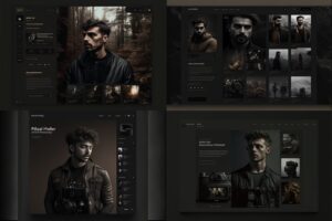
We first tried a simple photographer online portfolio, and we chose one of the generated to move forward:
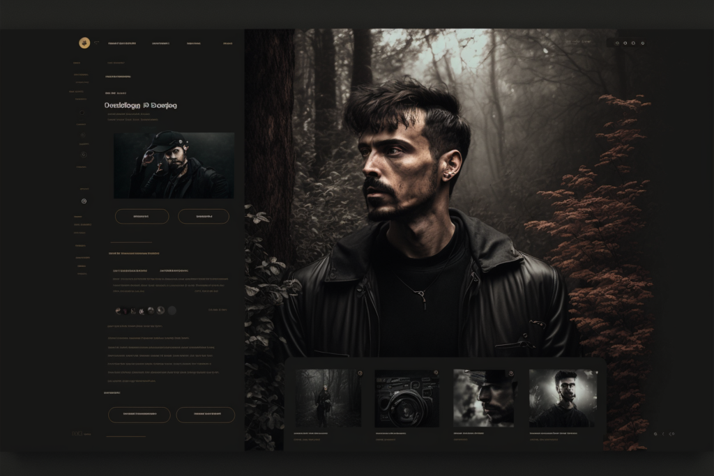
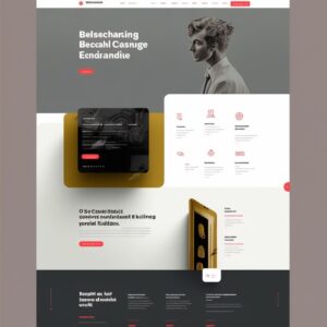
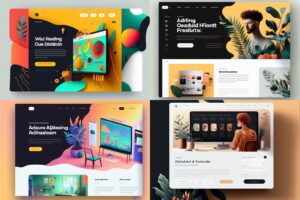
As it can be seen, the AI tool can generate a visually appealing interface, however, it doesn't focus on details. Buttons, small elements, and especially text are misformed making the interface unusable the way it is. Don't expect it to deliver a ready-to-use interface, it can't and it won't be a good interface.
However, The results are interesting and useful to start the project, considering that it will need some work to be a functional interface
We then replicate it on Figma to grasp an idea of what would be the process of using AI-generated websites for a real project - this is the first stage where a human needs to step into the process.
Our focus was to create a similar interface, but we noticed that a few elements were still not so intuitive, and here is, again, where a human should step in and understand what is needed for a better user experience.
We come up with a second version, just playing around with some elements, making the category selector more intuitive - it wasn't clear if it was a category selector, and what were the other categories.
Although we had to make some changes, we think that Midjourney did great work with a simple interface like a portfolio. In cases like this, we think that it could be used as a starter for quick projects.
However, how good would it be in different projects? We decided to go to something a bit more complex, as we were certain that it wouldn't provide an almost ready-to-use design.
A bit more complex website
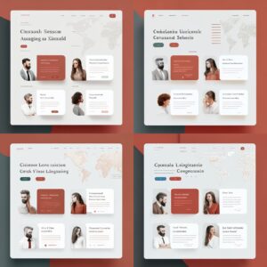
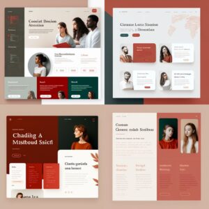
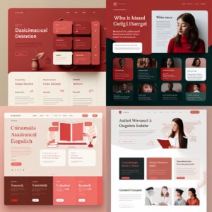
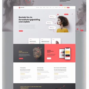
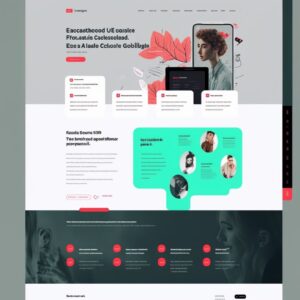
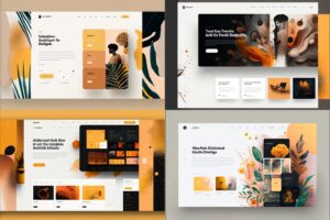
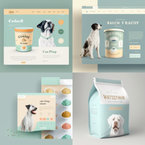
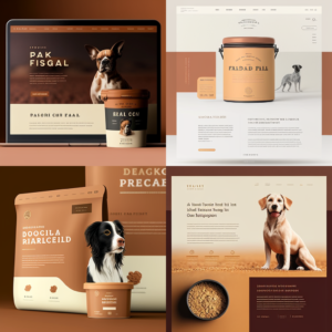
We asked for a language school website asking for a specific color pallet and generated several alternatives that were very interesting. The results were very pleasant and included the colors we requested.
However, none of the generated websites could be used as an initial base since the content wouldn't be the one that the AI tool generated. The content for this specific project would be very different from the generated image, and as we know in UX/UI, content is king and the interface needs to fit the content, not the other way around. This is the case where the AI-generated UI images would be used as (great) inspirations when creating a mood board, but not as a base for the first draft.
Generating a redesign of a content-heavy website
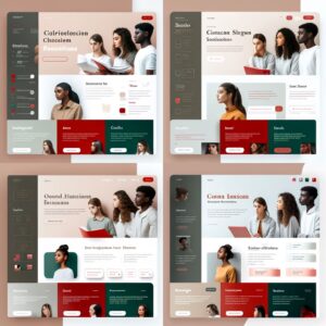
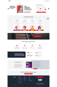
To test another possibility, we used a live website, www.culturainglesa.com.br, to see the extent of the capabilities of Midjourney in two ways: if the platform can use an image as a reference and produce a good result from it; if it could replicate the page as mentioned, making the interface fit the content.
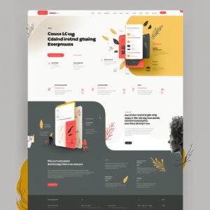
The results of several attempts with different prompts can be seen below - impressive nonetheless, it got the essence a bit and used the black and red of the brand, however, it's clear that it's still lacking a more human vision, content fit, and compliance with the branding as well - it used a yellow and green that was not part of the original website but were included in photos.
We gathered insights from the most interesting options and designed a quick version using the original content and the correct branding colors:
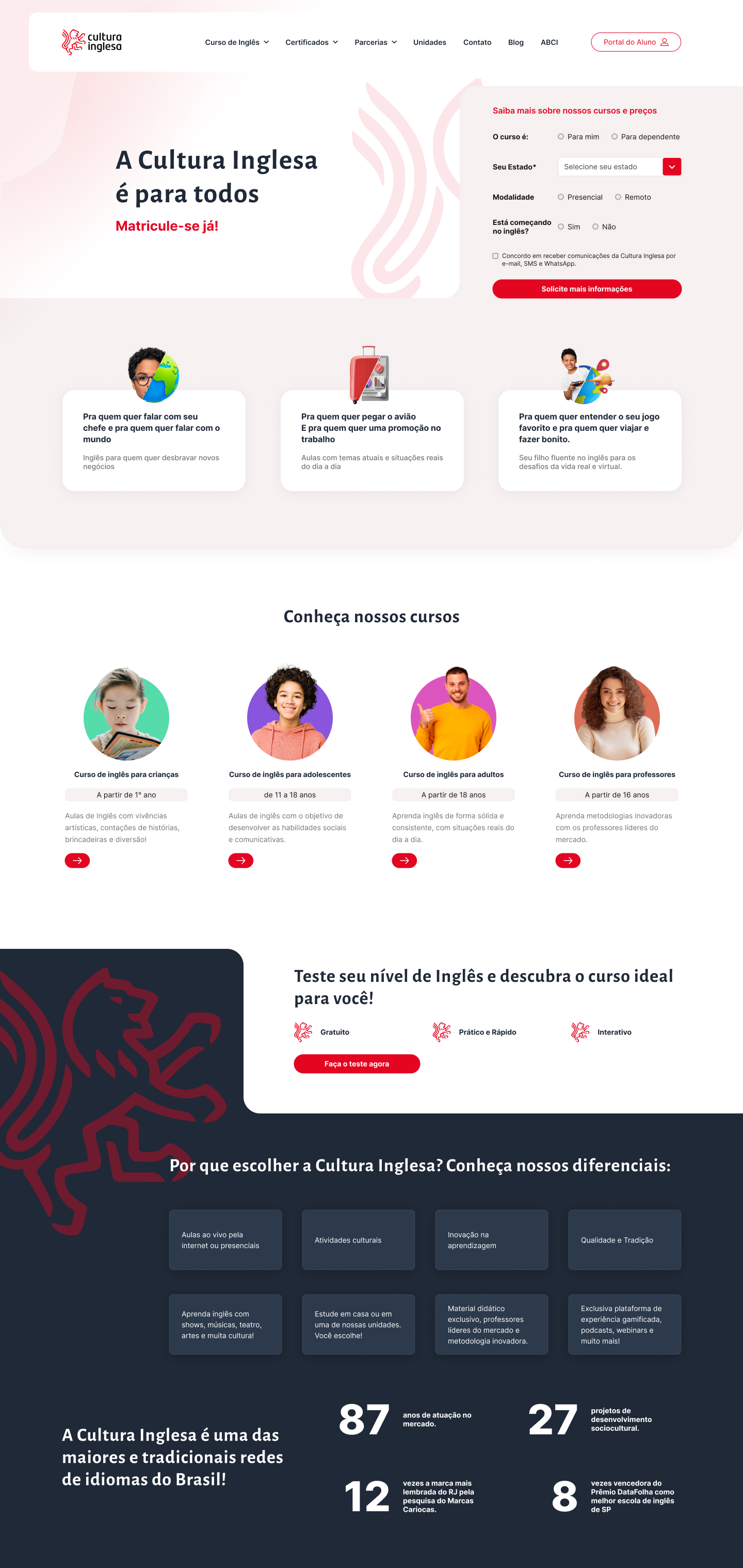
Overall we thought that it helped us to create a visually appealing interface, serving as original inspiration during our mood board process, saving us time. However, it took longer than just replicating the interface as we did with the photographer's portfolio.
In cases like this, it's valid to use AI-generated images as references for the designer's work rather than a quick tool to generate final interfaces.
Pushing AI to its limits - a more complex UI for a dashboard
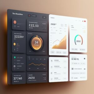
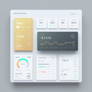
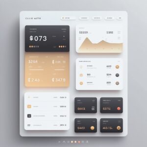
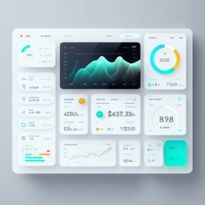
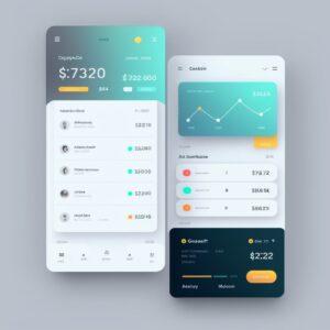
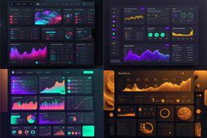
In a last test, we decided to see how it would handle a more complex interface for a digital product, so we asked to create a fintech dashboard, including information like credit cards, transactions, and quick action buttons. We got visually impressive results on the first attempt:
The results were very close to what was expected: a beautiful dashboard that easily can go to a fintech app mood board.
However, here is where UX is heavily damaged
- Lack of accessibility on several elements: We have elements that have a very low contrast ratio that makes them hard to see and read the texts
- Lose of focus: on some parts they have a lot of information going on
- There's no user flow to make a proper evaluation of how, where, and if elements can be presented.
We see again how important a proper UX process is needed to bring those AI-generated to life. A designer can understand the users' pain point and their needs in order to plan the project with personas, user flows, customer journey maps, and other tools that will guide the work toward a more intuitive user interface.
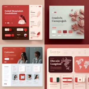
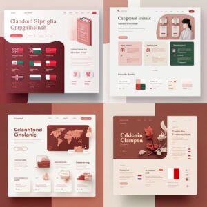
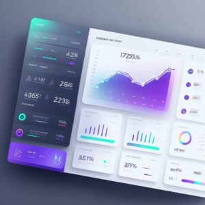
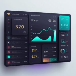
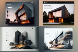
More AI-generated interfaces
Benefits and limitation of AI for UX/UI Design
As with any AI tool, it can’t fully understand or replicate the nuances and complexities of human-centered design. The designs generated by these tools are not necessarily ready to use as-it-is and should be viewed as a starting point and a source of inspiration rather than a replacement for human input and judgment.
It’s important to remember that UX design is all about creating a seamless and intuitive experience for the user. This means that the design must be tailored to the needs, motivations, and behaviors of the target audience who will be interacting with it, which an AI system can’t comprehend or anticipate.
It’s ultimately up to the designer to bring a human touch, empathy, and understanding to the design process, using their own expertise and judgment to make informed design decisions. Only through user research, testing, and feedback can you gather insights into what will work best for them.
The ability of any AI tool to generate precise results is also dependable on your ability to describe what you want with the right words. We had to try several different prompts to start getting a feeling of how to write good prompts. And even then, with each new idea we came up with, we had to make more attempts until we were satisfied with the results.
Another limitation is the impossibility to extract elements and images from the AI-generated images as they are not separated, you receive a PNG image file. Most of the time, even with simple projects like the photographer’s portfolio, designers need to use other elements or even try to generate them separately, for example, a banner background image.
Designers need to learn how and when to use AI
AI tools should be viewed as a supplement to the design process, helping designers to explore a wider range of options and possibilities before honing in on the design direction. It won’t take our jobs (at least for now), but embracing this new technology requires a critical sense.
In order to create truly effective and user-centered designs, designers must always be attuned to the needs and behaviors of their target audience, using a combination of research, testing, and their own expertise to guide design decisions.
As long as they strike a balance between the convenience and efficiency of AI tools like Midjourney and the unique perspectives and insights of human users, designers can create truly effective and user-centered designs.
Overall, our experience with Midjourney was positive and we think this could be a powerful tool and a valuable resource to help designers with particular tasks, as long as doing it with caution and not relying on them too heavily.
It's also clear that it's not even close to the end of our jobs, given there are several limitations that may not be resolved soon - or possibly ever? Who knows.
ps.: the banner was also created by Midjourney


