1) Show user unavailable options
Users shouldn't be guessing which option is available or not when they are searching for something.
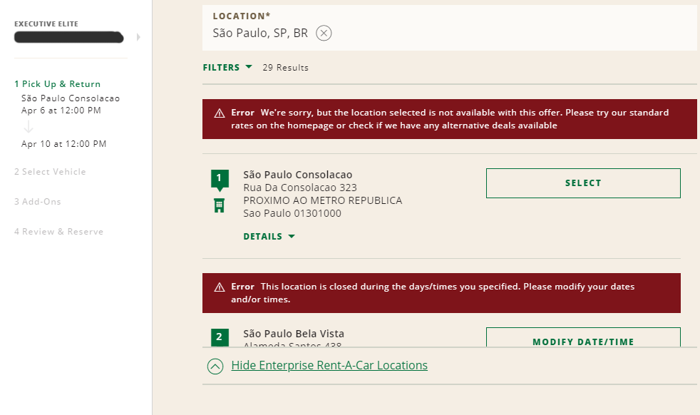
Take this search as an example. National Car Rental website shows the user all the locations available to book a car for the dates already selected, but when you try to select one of them, two errors appear: either the store doesn't open at the selected date and time, or the store is not valid for the promotion code added.
As you can see, many stores in São Paulo area supposedly are "available" to book (the red error only shows after you try to book), but after 2 minutes of clicking on all of them, only 2 or 3 were actually accepting bookings at given filters.
The only exception I'd like to mention is when the unavailable option is placed in the results as a marketing strategy. As an excellent example, I can show Booking.com - which by the way does an awesome job with their UX.

They do show unavailable options (but notice here that the message about it is already visible to the user without having to click, it doesn't leave the user confused thinking that's available), but to induce a sense of FOMO, i.e., fear of missing out. They are indirectly saying "Hey, look, this hotel is sold out because you were late, act now or you'll miss more opportunities". This is also an example of the thin line between UX and marketing. Read more in our article.
Solution
The user is already doing a search, which basically is a filtering action, so give it the proper treatment and only show the available results.
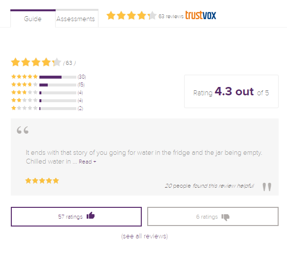
2) Text hard to read because of the font weight and color
Solution
Never use fonts too light in small texts, and always check with web accessibility evaluation tools if your design is compliant with WCAG rules to avoid lawsuits.
3) Forget to disable a button after clicking on it and the lack of feedback about the interaction status

This bad UI pattern can bring two potential issues: first, keeping a button active before finishing the first action can cause bugs and errors, and it doesn't avoid user mistakes. Secondly, it doesn't inform the user of the current status of the interaction, making them confused if the action was really through when it should give a result, if any error occurred, etc.
Both bad UI patterns together are a snowball because the user will start repeating the action endlessly, getting out of there frustrated, or even worse, with several actions taken without knowing - for example a purchase that went through but had a bug to redirect to a confirmation page, as the case with Tesla.
Solution
When the user clicks on the button, place a message first that the information is being processed and disable it to avoid it being clicked again while the process is not finished.
After the process is done, make sure the system is working fine and returning the proper system status. Show it to the user in an intuitive and "human" way. "Error xxxx" is not enough for the user to understand.
4) Low contrast between different element states
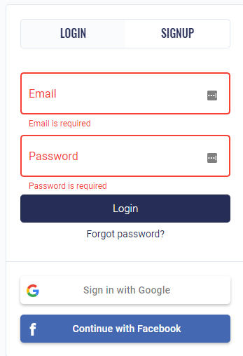
When you need to differentiate the status of elements, you need to do it right. Low contrast will not make it clear they are not the same. This example below shows a login/signup popup, but it's really hard to know which tab is selected because the blueish background is very light, which blends with the overall background.
It's possible that you can't even tell the difference because it depends on your screen brightness and eye capability - trivial accessibility rules are not being implemented. It gets worse in this case because the login/signup contents are very similar.
Solution
Increase the difference between close elements with different statuses and backgrounds, always checking if the solution is compliant with WCAG rules for accessibility.
5) Confusing unsubscribing process
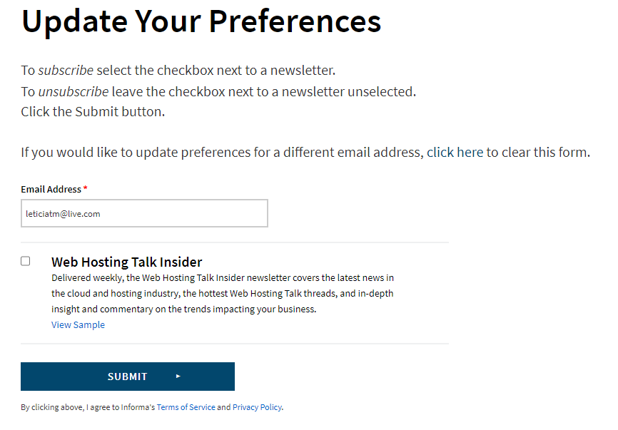
Our inbox sometimes gets full of marketing and we need to unsubscribe from them. Some of them are really used to doing so, and some don't even need further action other than clicking the "unsubscribe" link.
However I've encountered some that are really easy to misinterpreter the information, it even seems like they do it on purpose.
The example below is so badly done that it needs to explain to the user how to subscribe and how to unsubscribe.
If you ignore the texts above the checkbox, you may be wondering if you need to check the "Web Hosting Talk Insider" to unsubscribe from it, or if the check means that you want to keep subscribed to that list. The button also doesn't help, just a "submit" text doesn't tell anything to the user.
A self-explanatory design guides the user while they are on it. It provides necessary help and guidance to its users in a natural way.
An intuitive interface guides the user through the steps in a natural way, without thinking hard to understand what should be done, and without having to explain itself.
Solution
Remove unnecessary texts, and use intuitive elements that represent the desired result understandably.
Also, it's important - if possible - to make a customized page for the required action, it avoids confusing with unnecessary information. If the user is subscribed and they've clicked on the link inside the email to stop receiving them, the best approach is to lead the user to a different page than "update your preference" if the only possible action here - and the desired result - is to cancel the subscription.
Web and mobile app design is crucial for the digital landscape. We have showcased here problematic some UI patterns that can negatively affect the UX, and by implementing solutions, designers can overcome challenges posed by suboptimal UI patterns and deliver a better UX.
Let us take inspiration from this article and strive to design interfaces that are both aesthetically pleasing and user-friendly.
Worried about bad UI patterns?
Pengreen Design has an expert team that offers design solutions for businesses to avoid bad UI patterns.
Unlock the full potential of your digital product with our transformative UX Audit! Uncover hidden design flaws that might be hindering your product's success, some of which you may not even be aware of and may be costing your users and money.


