Have you been wondering how to improve the user experience of your digital product? How to make it more intuitive and easy to use, with higher conversion and retention rates?
User experience design is a discipline that focuses on creating an accessible and enjoyable experience for users of digital products and services. It’s a vast field with many nuances, yet it is often oversimplified by the general public in the form of advice such as “Just put a pretty face on your site!”
The best user experience doesn't come from an algorithm that analyzes data and figures out the best way to serve your users. Instead, it results from an intimate knowledge of users and the way they interact with technology, you need to understand them. By understanding their needs, habits, and goals, you can design a better user experience.
That being said, the user experience is not purely about technology, you need to consider the user journey. This means knowing where users start from and what their goals are.
With user experience, you should also think about how users feel while using your app. Do they feel comfortable and welcome? Or do they feel distracted, frustrated, or annoyed?
Here are some tips on how to design a better user experience.
Start understanding your users’ needs and demands with a UX Research

The best way to start improving the UX of your product is to focus on the user who uses it before any design and implementation are done, either to start a new digital product or to improve an existing one.
If you don’t know what your users want and need, then the end product will likely be sub-par. Study your target audience to gain insight into what they want to design interfaces specifically for that public.
This can be achieved by conducting a UX Research to gather data and insights on what people want and need from your product, how they interact with the interface, and their behavior along the user journey within a digital product.
A UX Research study can involve a survey, focus groups, user testing, or interviews to collect information on their demographics, behavior, and problems they face. The data is prioritized according to what is most pressing for the users and used to inform product decisions and propose proper solutions.
Conduct a UX Audit

Meanwhile, a UX audit is a process of inspection and evaluation of the design of an existing product. Basically, a deep dive into your digital product. It is a systematic analysis of the user experience with the goal of identifying areas for improvement and getting the designers aligned on the right strategy.
It helps you understand how people use your product and how they feel about it, uncovering potential problems and suggesting potential solutions. A UX audit is a great way to take a second look at your product and see what could be improved in terms of UX.
A good UX Audit will help you build a product that people love to use.
Keep it simple, focus on the functionality

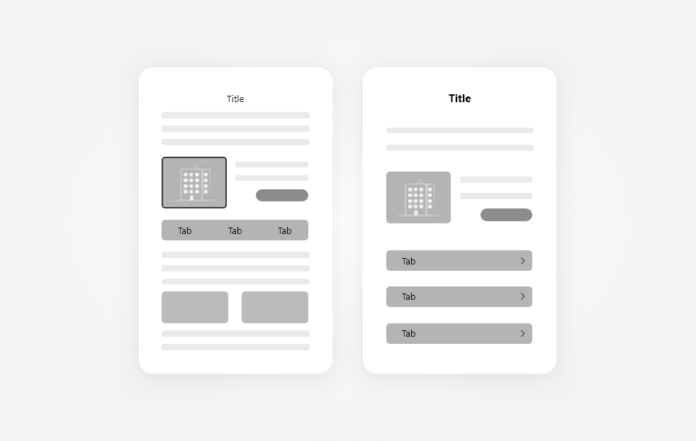
When designing an interface for a product it is important to keep it simple. The idea of design simplicity for a better UX is not just about doing less, but doing what is important, being objective, and delivering straightforward information and directions in a clean interface that will guide users to accomplish their goals.
The simpler an interface is, the easier it will be for users to navigate and the less likely they will bounce. Because of that, it's important to focus on the content and functionality rather than focusing on purely visual elements. They are important as well, a visually appealing interface helps build trust and express professionalism, but they are rather an add-on.
It's important to understand that simplicity is not the same as minimalism design. It can definitely be used if it suits the overall look 'n feel, but we can also achieve simplicity by creating an atmosphere that is free of clutter, taking away what does not add value to the interface. Increasing whitespace is also helpful to legibility and it's faster and easier to find what users need.
Accessibility

Accessibility means making sure that anyone can use your product, regardless of their physical or cognitive abilities.
With the rise in people with disabilities and the overall internet usage where 67% of the world population has access to the internet, accessibility has become a standard expectation with websites and digital products.
Some simple changes can make a big difference for many people. By making small adjustments you can create an experience that is truly accessible for all. Image captions and alternative texts for example can make the visually impaired understand what is shown in the image because the screen reader will read the provided texts as a description of what the image represents.
Existing documents like WCAG 2.0 (Web Content Accessibility Guidelines) from W3C (World Wide Web Consortium) or Section 508 from ADA (Americans with Disabilities Act) provide recommendations on how to create accessible websites and apps.
Lack of accessibility is even a case for lawsuits. In the USA, the previously mentioned ADA Guidelines are a requirement for most businesses. Not being ADA compliant can lead to lawsuits. Thousands are being filed every year and it can mean from 10 thousand to millions in losses.
Maintain design consistency throughout the journey

When designing your digital product, it’s important to continue certain patterns through the user flow. Elements, colors, fonts, copy, icons, interactions, and overall look 'n feel should be homogeneous and repeat themselves throughout the product. This creates a cohesive experience for your users and allows them to navigate through your product with ease.
Design consistency provides a sense of familiarity and comfort to the user and reduces the chances of them getting lost. It avoids having to relearn a pattern for similar content and getting confused, improving the overall usability.
We do that by defining a scalable design system right at the beginning of the project, keeping the consistency of the elements even if they are modified later. It's easier to scale the product in the future as well.
Applying the best practices for UI also helps users recognize widely used patterns that were already extensively validated. It's a way to start off on the right foot especially if you for any reason can't do a UX research before designing the interface.
Ask for User Feedback

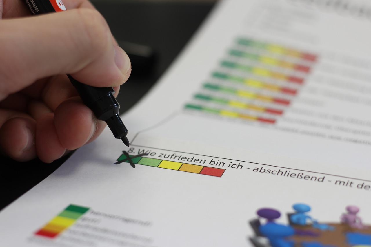
Without knowing what users are experiencing while using your product, there's no way to improve it. If they have a bad experience and don't have a way to tell you about it, you might lose the user and don't even know why.
There are several ways to ask for feedback from users and it all depends on how they use your product, but the most important is to ask it promptly. Have a feedback tool right inside the product, or ask when the user is leaving or after a specific event, such as at the end of a journey as a purchase in an e-commerce. Just the fact that you're asking for feedback shows that you care about the user experience.
The cost to acquire a client is much higher than retaining one. Meanwhile asking for feedback is free and one of the easiest ways to improve the experience to keep users satisfied.
Conclusion
UX design is a growing field that is constantly evolving. There are many ways to improve the UX for your digital product, and maybe most of them need a team of experts to implement them.
Pengreen Design is a specialist in improving the usability of digital products and can handle a UX Audit for your digital product. We help Software Development Companies reduce their frustrations with bad conversions rate and low satisfaction from customers by understanding users' behavior and delivering the right content they need and expect. Our team of experts can go through your digital product and identify potential issues that may be driving customers away.


